The Art of Composition
Having grown up in an artistic family, the basics of composition in a painting, drawing or photography were second-nature. Even the way my dad would landscape the yards we had in Glendale and San Clemente had a basis in design and composition. In photography, the rules of composition apply just as much as they do in other visual art forms. As I return to an art form that I loved so much, I find that those basics of composition are still with me - just as much a part of me as my memories of places, or my mom's singing, or the Sunday dinners at home.
In photography, using the basics of composition can make the difference between a "meh" picture that you see on Instagram, to one that makes you say "WOW!" and you click the little heart icon to "like" it, or even go so far as to comment on it. And as I have been viewing other photographer's work on Instagram (which is a great platform for serious amateur and professional photographers), I'm seeing many images that COULD be "WOW!", but are just "meh", because the person did not use those rules of composition.
Now, in fairness, many folk who use their smartphones to capture images have never studied art, or the rules of composition, and out of fairness we can't dismiss what they tried to do: capture something that stirred them emotionally. And some of those folk that I see on Instagram may have a natural ability to understand what makes a good image, and they take it without even thinking of it, and select a filter that gives them that emotional feeling they had in that fleeting moment. And, to be fair, even those who MAY know about composition are not going to be successful in every attempt they make to capture the emotional response to what they are seeing.
So, what are the basics of good composition, and since my art is photography, what is good photographic composition?
RULE OF THIRDS
The first thing that most photographers comment on is the rule of thirds. When I see a perfectly symmetrical image, with the horizon line smack in the middle, or a vertical object that divides the scene perfectly in two, I respond in two ways: either the photographer was intentional in this; or they had no clue about the rule of thirds. The rule of thirds states that you divide your frame into three horizontal sections, and then three vertical sections, like this:

The four points where those verticals intersect are call the points of interest. So, the goal, especially if you have a subject in your image, like this shell, is to have it at one of the points of interest. Here, it's in the lower right point of interest. But notice too that the horizon is dividing the middle and the upper third of the frame. This is a very strong compositional element, and creates a dynamic image.
LEADING LINES
Leading lines are important, because they bring the viewer into the image. Having strong leading lines create a sense of depth, which psychologically bring the viewer deeper into the image. Here's a good example of leading lines taking you in, all the way to the back of the image. Also notice that the vanishing point (where the road disappears in the distance) is near the upper left point of interest. This images invites you to "enter" into it, and experience it, due to the leading lines.
 |
| Taylor Creek Road, 1997, copyright John Prothero 2016 |
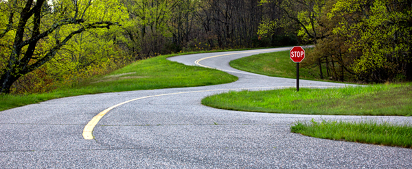
CURVES, DIAGONALS AND TRIANGLES
There are basically two types of curves you can use in photographic composition: an S-curve, and a C-curve. Either one are strong compositional elements. I particularly like S-curve, as in this image below taken on a winding road in the central California coastal hills. As with leading lines, S-curve that start at the bottom, or the corner of an image, lead the viewer into the photograph, enticing them to be part of what they see.


As you can see, using diagonal lines can inherently lead to triangles, so you've used two different compositional techniques to strengthen your image.
FIBONACCI SEQUENCE OR THE "GOLDEN RATIO"
No, we're not talking about something out of a Dan Brown novel. The famed Fibonacci Sequence from "DaVinci Code" was a real sequence of numbers, which is manifested in a strong compositional element as seen here:

Notice how the image has a cluster of something at a starting point, and then the rest of it spirals out. For me, I use this technique quite a bit, yet it's more instinctive. And you can apply it in any orientation in the frame, and within a portrait or landscape orientation.
WHY IS THIS IMPORTANT?
Well, let's look at what I'd say is a poorly composed image.

When you look at this image you see that the seawall is just about in the center of the frame. Thankfully, it's closer to the line that divides the middle third of the image and the bottom third. But what really stands out is that this while tower is smack in the middle of the frame, and is a white tower brightly lit. When viewing this image there is little sense of depth, little sense of movement, and so you don't feel compelled to enter into the image - it doesn't engage you. Bright objects in an image stand out and come out at you. So, by this white tower being in the middle, there is nothing that leads you into the photograph. In fact, the white tower grabs all your viewing attention. It just sits there, sterile. Some ways the photographer could have made this interesting was moving the white tower to one of the vertical lines in the frame. I would have gone closer to the seawall and have used that as a leading line into the tower. Also, this is strongly backlit, which can be problematic. Having a strongly side lit subject is more interesting.
WHERE DID I LEARN ALL THIS?
Well, not only did I learn from observing my parents and taking art courses, when I used to do large format photography, you have to rely upon composition in order to make sure the image is going to be worth printing, or for that matter, exposing. Large format film and processing is an expensive venture. But it did force me to look at images from a pure compositional standpoint and even from a lighting standpoint. Let's look at one of my black & white images taken of a sand dune in Death Valley National Park. On the left is the image I printed. On the right is the same image as it appears in the back of a large format camera: upside down and backwards.
 |
| Sand dune, Mesquite Dunes, Death Valley National Park, 1994, copyright 2016 John Prothero |
When I was viewing the scene on the ground glass of the 4x5" camera, I had to look at what drew me into the scene very carefully. I emphasised the foreground, which uses shapes and curves to enhance it's composition, and then I put the sky at the top of the frame because I wanted the viewer to be pulled into the image - I wanted them to be compelled to walk on the dune. Then I did additional work in the darkroom to create the deep shadows. Photography uses the psychology of dark and light - dark recedes, light comes forward. By having a very dark dune at the top, the image now has a sense of depth and distance.
By using various elements of composition, whether your taking an image with your iPhone, or with a DSLR, or large format, you can create stunning images that have the ability to elicit strong emotions from the viewer, and take your images from "meh" to "WOW!"

Comments